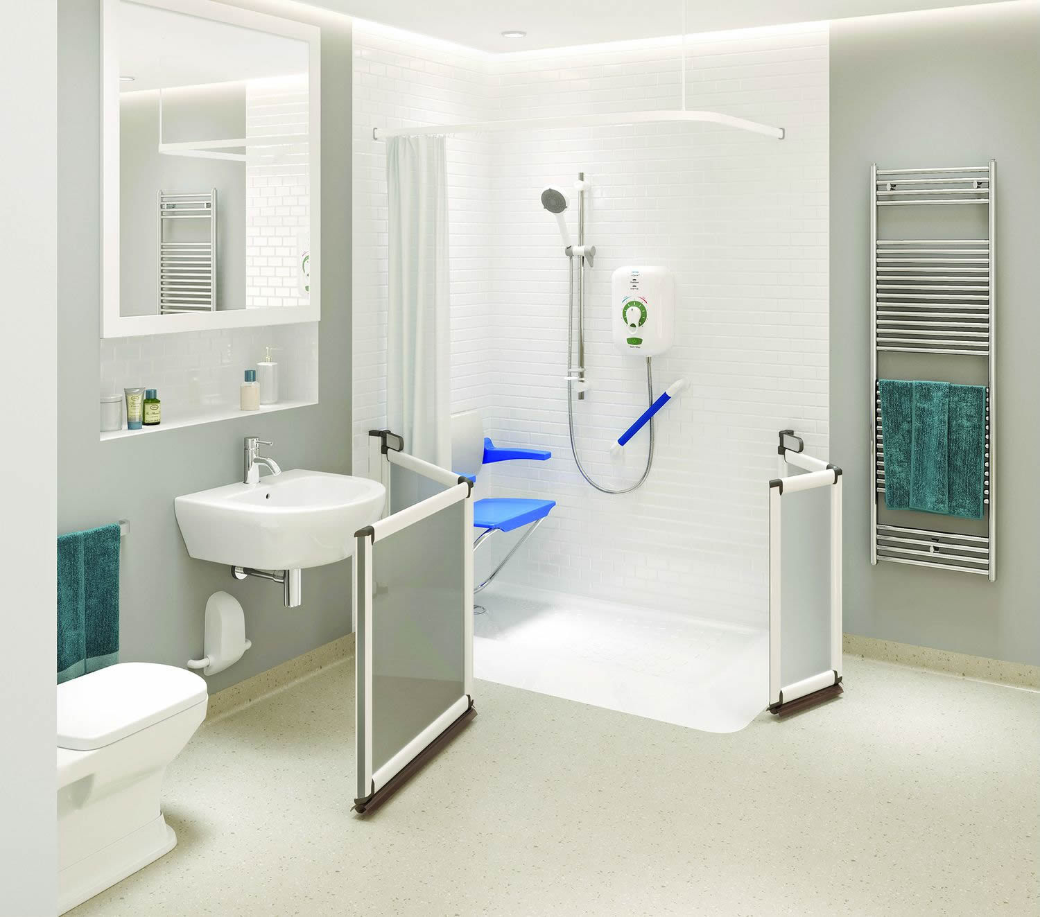
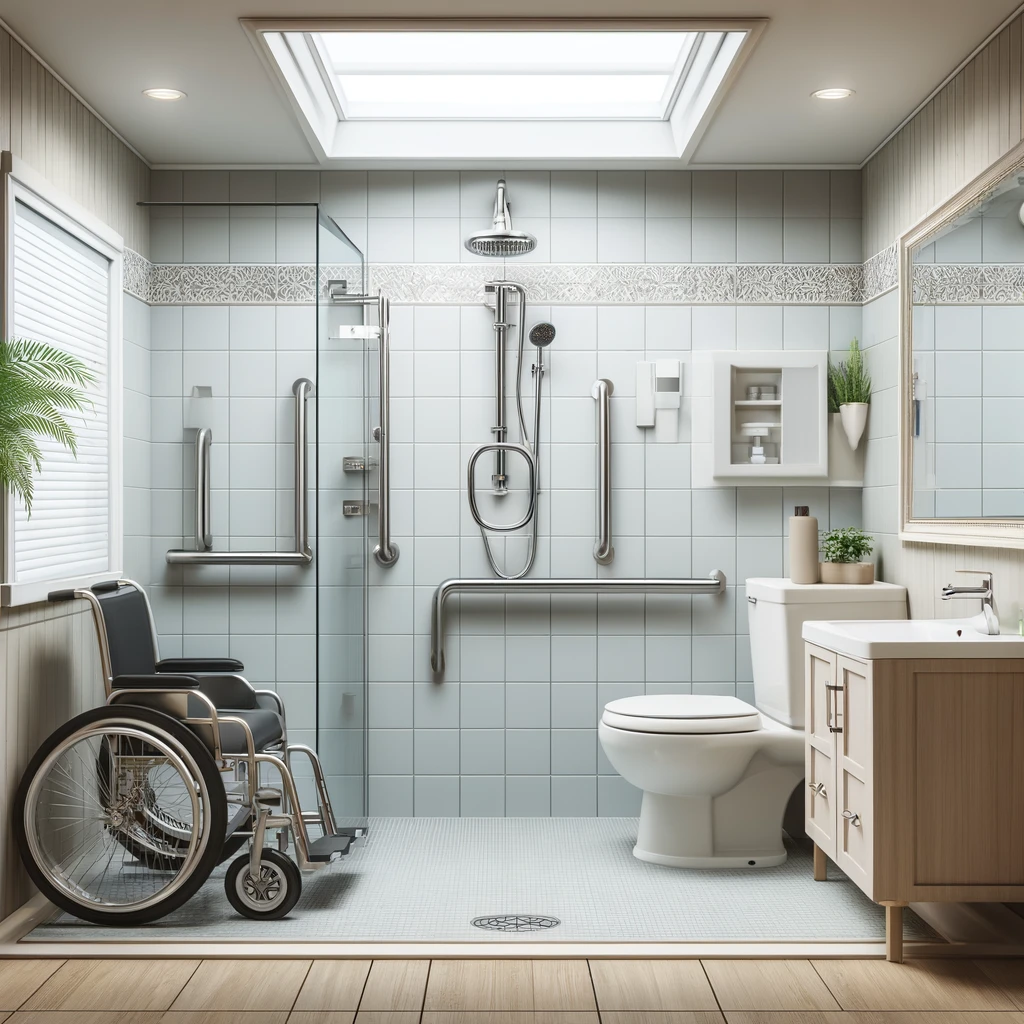
Short answer: For most homes, white is the best colour for a bathroom suite: it lasts, suits any style, is easy to replace and appeals to buyers. Bring in personality through walls, floors, furniture and taps instead. If anyone has sight loss or dementia, choose colours that contrast, such as a dark toilet seat on a white pan or a floor that differs clearly from the walls.
Why white is still the safest choice
The suite is the toilet, basin and bath or shower tray. These are the most expensive and disruptive parts of a bathroom to change, so it makes sense for them to be the parts that date least. That is why white remains the most popular choice by a wide margin.
- It does not date. Coloured suites from past decades, such as avocado, pampas and peach, are now a sign that a bathroom needs replacing. White has never gone out of fashion.
- It goes with everything. You can change the look of the room with paint, tiles, towels and accessories without touching the suite.
- It is easy to match. If a basin cracks or you add a second toilet, a white replacement is easy to find. A coloured one may be discontinued.
- It shows you it is clean. Marks and limescale are easy to spot on white, which helps when keeping the room hygienic.
- It appeals to buyers. A white suite in a well-fitted room rarely puts anyone off.
The downside to white
An all-white room under bright cool lighting can feel cold and clinical. It can also be hard to use for anyone with sight loss, because a white toilet against white tiles and a white floor can seem to disappear. The answer is not to avoid a white suite, but to surround it with colour and contrast.
Other suite and finish colours compared
Coloured sanitaryware is less common now, but colour often appears in matt black or grey basins, coloured vanity units, wood effect furniture and painted or panelled walls. Here is how the main options compare.
| Colour | Best for | Things to watch |
|---|---|---|
| White | Any home; long-lasting and easy to resell | Can feel clinical without warmer lighting and contrast |
| Grey | Calm, modern rooms; furniture and wall panels | Too much grey can feel flat; check it contrasts with the suite |
| Black | Taps, shower fittings, frames and accent basins | Shows water marks and limescale; can make a small room feel smaller |
| Wood or wood effect | Warmth; vanity units and shelving | Choose finishes made for wet rooms and bathrooms |
| Green | Natural, relaxing schemes with earthy tones | Strong greens are a trend choice and may date |
| Blue | Fresh, restful rooms, especially with white | Very bright blues can be overpowering in a small room |
Grey
Grey sits between white and black and works well for furniture, wall panels and floor tiles. Paired with a white suite, it gives a soft, modern look. Use more than one shade, and make sure the grey is clearly lighter or darker than the suite so the fittings stand out.
Black
Matt black taps, shower valves, rails and mirror frames are popular because they give instant definition to a white room. A whole black suite is a bolder choice. It can look striking, but in hard water areas it shows marks quickly, and in a small room it can absorb light.
Wood and wood effect
Wood tones add warmth, especially in vanity units, shelves and floors. Solid timber is not always suited to a damp room, so many people choose wood effect finishes designed to cope with moisture. Wood effect flooring or furniture also gives a natural contrast against a white suite.
Green and blue
Soft greens and blues are calming and work well on walls and panels. Sage, muted teal and pale blue pair well with a white suite and wood or brass details. Very saturated shades are more of a trend, so keep them to walls that are easy to repaint.
Colour contrast for sight loss and dementia
For many of the people we work with, colour is not just about style. Good contrast helps people with sight loss, cataracts or dementia find their way around the bathroom, judge where to sit and avoid falls. It is one of the simplest and cheapest safety features you can add.
The idea is called tonal contrast. It means a clear difference in lightness between two surfaces, not just a difference in colour. A pale green and a pale grey may look different to you but merge together for someone with low vision.
Where contrast matters most
- Toilet seat. Guidance in BS 8300 for accessible toilets says the seat should contrast visually with the pan and cistern. At home, a dark seat on a white toilet is an easy change.
- Grab rails. Rails that stand out against the wall are easier to find and grip.
- Floor and walls. A floor that is clearly darker or lighter than the walls helps people judge the edges of the room.
- Shower area. In a level access shower or wet room, a contrasting shower seat and controls help the user see where everything is.
- Door frames and switches. Contrasting frames and light switches help people find the way in and out.
Things to avoid
- Busy patterns on the floor, which can look like steps or objects to someone with dementia.
- Very dark mats or floor patches, which may be mistaken for holes.
- High gloss surfaces that cause glare under bright lights.
- All-white schemes where the suite, walls and floor blend together.
If someone in your home has a specific condition, an occupational therapist (OT) or their GP can advise on what will help them most. Our guide on how to design a bathroom for a disabled person covers contrast alongside layout, lighting and controls.
Colour, value and resale appeal
If you may sell in the next few years, neutral colours make sense for the parts that are hard to change. A dated or tired bathroom can put buyers off, while a modern, well-fitted one helps a home sell. Our post on how much value a new bathroom adds to your home explains what buyers tend to look for.
Accessible features do not have to look institutional. A white suite, contrasting seat, slim rails in a finish that suits the room and a tiled level access shower can look like any modern bathroom. To see how this comes together, read about what an accessible bathroom looks like today.
Choosing a colour scheme that works for you
A simple approach suits most homes:
- Keep the suite white or a soft neutral. It is the most expensive part to change.
- Add colour where it is easy to change. Paint, wall panels, towels, blinds and accessories.
- Choose one feature. A coloured vanity unit, a patterned wall or black taps, rather than several competing ideas.
- Build in contrast. Make sure the floor, walls, toilet seat and rails stand apart from each other.
- Check colours in your own light. Samples look different under daylight and bathroom lighting, so view them in the room at different times of day.
- Use warmer lighting. Even, glare-free light with a slightly warm tone stops a white bathroom feeling clinical.
A 3D design lets you try different colour combinations before anything is ordered. Our disabled bathrooms and disabled wet rooms are designed to be safe and easy to use while looking like any other stylish bathroom.
Not sure which colours will work in your bathroom? Our free 3D design lets you see your choices in place, and our quotes are no-obligation. Request your free design.
Frequently asked questions
What is the most popular colour for a bathroom suite in the UK?
White is by far the most common choice. It suits every style, is easy to replace or match, and appeals to most buyers. Colour usually comes from walls, floors and furniture instead.
Is a coloured bathroom suite a bad idea?
Not necessarily, but it is harder to change if your taste moves on or you decide to sell. If you love colour, consider a coloured vanity unit or wall panels, which are easier and cheaper to update than the toilet and basin.
What colours help someone with dementia use the bathroom?
Clear contrast helps most: a toilet seat that stands out from the pan, rails that stand out from the wall, and a plain floor that differs from the walls. Avoid busy patterns and very dark mats. An OT can give advice for the individual.
Should the toilet seat be a different colour from the toilet?
In an accessible bathroom, yes. BS 8300 guidance for accessible toilets says the seat should contrast with the pan and cistern, and the same idea helps at home for anyone with low vision.